Web Gallery Home


Exhibition - My Best Pieces

Artist: Neil Huggett: I wanted to put together a display of 12 of my best pieces. These pieces were all produced in South Australia, in a period of around 40 years. I would ideally like to see an exhibition of these pieces at a major gallery in Adelaide. I see the value of these pieces in being excellent examples of artwork, that show some of my unique means of expression. All of these pieces show very high levels of skills and management. I believe all of these pieces are master works, best enjoyed as real pieces.

I hope that others who see these pieces will feel inspired and moved by them. I know that I won't be producing pieces such as these in the future; most of these pieces required spending months of concentrated work on them, and I no longer have the physical condition, or drive to produce pieces such as these.

The pieces in this display are presented in chronological order. More detail about each piece can be gained by clicking on each image, or on the link for more information in the text below each image. The pages that have more information about each artwork can be viewed in the same sequence as the artwork images on this page.


1. Soft Colours In The Western Sky Before Sunrise


Soft Colours In The Western Sky Before Sunrise
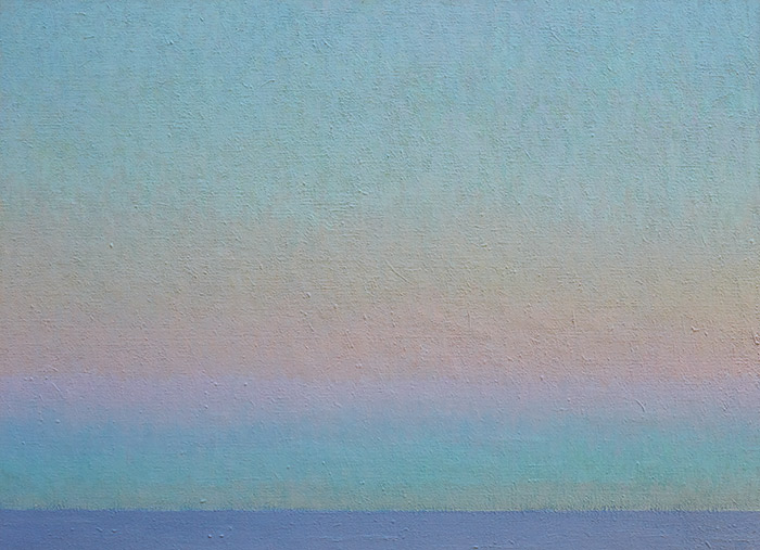
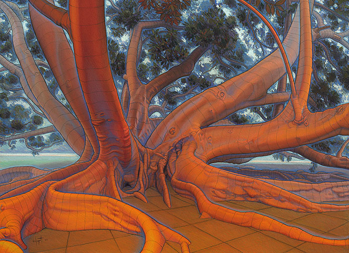
84 cm (w) x 61 cm (h), oil paints on linen canvas.
Date produced: 1985

This was painted directly from on-site observation, from West Beach, just before ‘sunrise’. I remember needing to get up very early to get dressed and take all of my needed equipment out to the beach to set up ready for the colours seen before dawn. I was interested in the subtle bands of soft colours in the sky that are seen in the western sky above the sea, just before sunrise during clear mornings (without clouds). These subtle colour bands are amazing spectacles that feel to me to be both emotionally calming and inspiring at the same time. I know from many observations, that these soft bands of colour do change their size and intensity quite quickly, so I needed to be well organised and record quickly, around a certain time just before dawn. The actual time did change as the weeks passed. I needed many sessions (mornings) of similar clear sky conditions to record the spectacle I was after. More information...


2. The Sun


The Sun
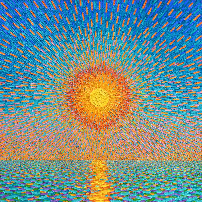
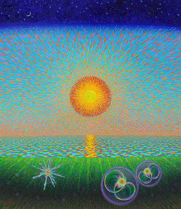
66 cm (w) x 66 cm (h), oil paints on linen canvas.
Date produced: 1986 - 1987.

The original idea for this piece was developed as a pastel drawing on brown paper, from another pastel drawing carried out on-site during one sunset, seen at West Beach. The square shape and placement of the sun in the exact centre of the square are deliberate compositional choices. I wanted a mesmerising sun, a sun which provides our daylight, a sun which is the centre of all continued life on our planet, and a sun that appears to rise and set on a daily basis (hence picking a time just before sunset).

I wanted a simple composition, which could be like a classical symbol with a strong statement. In this way, I wanted to develop an image which was similar in nature to many of the paintings by Vincent van Gogh. So we have the sky, the sea, the approaching night, and the sun with its brilliant, warm radiance. Light is broken down into pure, ‘simple’ colours (I actually found that the subtle tone of the colours was vitally important for the sense of radiation), applied with deliberate radiating strokes.

More information...


3. Reclining Nude from the Back


Reclining Nude from the Back
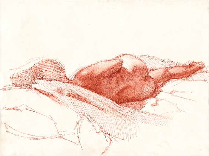
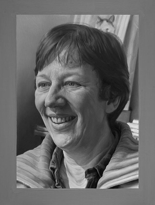
50.5 cm (w) x 37.5 cm (h), conté on cartridge paper.
Date produced: 1989

Drawn directly from a ‘life drawing’ model, during my degree (B.Ed. - Secondary Art Teaching). I am very happy with this result. Highlight areas for me (shown in the following three detail images), were the forms in the shoulder region, the lighting across her lower back and buttocks, and the soft flesh behind her knee.

Because I usually work directly (on-site) from natural environments, much of my work could be considered to be ‘life drawing’.

In my early twenties, I would regularly travel to an organised life drawing studio for drawing sessions. I enjoyed the discipline aspect of this type of drawing - the human figure needs to be drawn extremely accurately, or it will look/feel malformed. We all judge human forms constantly in our daily lives, and so are highly critical of such images. As part of the activity of striving to achieve accurate representations of human forms, I found that I became more interested in concentrating on smaller sections of the body, that I felt showed highlights of beautiful form and light in the overall scene.

More information...


4. Form and Space – The Sugar-Berry Tree


Form and Space – The Sugar-Berry Tree
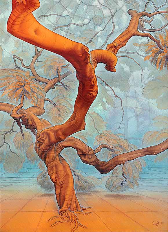
55 cm (w) x 75 cm (h), conté and pastels on acid-free coloured-ground ‘Canson’ paper.
Date produced: March 2001 - May 2002.

This was produced entirely on-site, at the Botanic Gardens in Adelaide over about 40-50 separate half-day sessions. This magnificent tree has so many interesting features that I wanted to try my skills at capturing some of them. The tree is located in a quiet, shady corner of the Botanic Gardens, away from most of the foot traffic that goes through the gardens. This drawing went through considerable development. In the end, my overall plan for the drawing was to use an 'exaggerated aerial perspective' to capture most of the forms of the tree and the surrounding space. That is, I wanted to use colour to express (or give an indication of) how close or how distant various surfaces were (the more orange a surface was coloured, the closer it felt, and the the bluer a surface was coloured, the more distant it felt). I also wanted to try to express the space and air around the forms using pale blues to surround appropriate sections of the forms. This approach required working with very subtle changes of colour.

I also wanted to include contour lines that were 'felt lines' that I could imagine going around the various 3-dimensional forms that I saw in front of me. I found that these contour lines helped to express the forms that I could see clearly using my stereo vision. I also found that applying grids was useful for indicating surface orientations and spaces.

The combination of the exaggerated aerial perspective, with the contour lines and application of grids over surfaces or spaces, creates new types of images. These images are of real 3-dimensional objects and spaces, but they are not photographic in the colours used.

More information...


5. From the Foot-Bridge Through the Forest


From the Foot-Bridge Through the Forest
75 cm (w) x 55 cm (h), conté and pastels on acid-free coloured-ground ‘Canson’ paper.
Date produced: May 2002.

A Yellow-Tailed Black Cockatoo flies slowly along the valley. Walking across the footbridge, which stretches across the pine forest valley through the cleared area shown in the drawing, often makes me feel as though I am floating, or flying. I deliberately didn’t draw in the bridge, and wanted to draw the scene as if I were floating without the bridge holding me up (which is why I wanted to show the point directly below me). I’ve used a very wide-angled curved-space view, with an exaggerated ‘aerial perspective’ (in the colouring), to help express the forms, structures, and hopefully even the ‘breathing’ air around everything. I applied grids over the surface of the ground and around the tree forms, to help give a stronger sense of form, structure, and orientation.

Drawn partly on-site, in the pine forest at Flinders University, and drawn partly in my studio at home directly from an earlier drawing that was done entirely on-site.

I am very proud of what was attempted in this drawing, and what was achieved. More information...


6. Inner Strength - Moreton Bay Fig Tree, Angas Gardens


Inner Strength - Moreton Bay Fig Tree, Angas Gardens
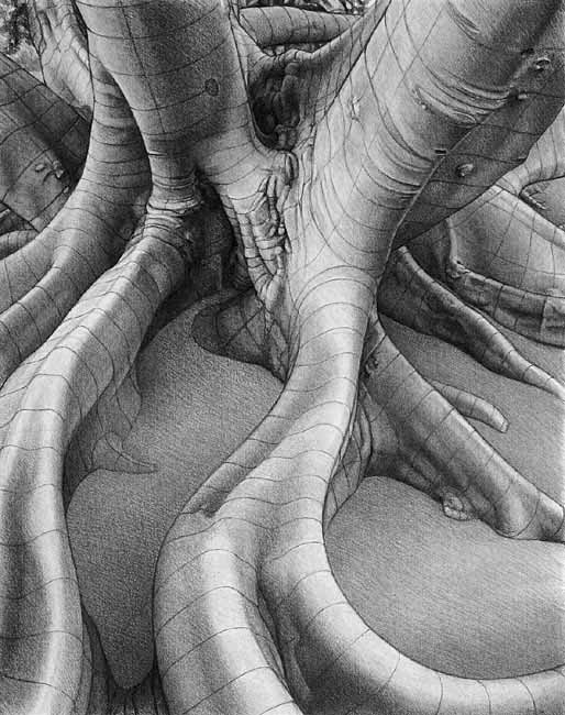
58 cm (w) x 76 cm (h), charcoal on cream acid-free drawing paper.
Date produced: March - May 2005.

I produced this drawing entirely on-site in the Adelaide Park Lands. It was produced as part of an art project called "Microcosm", where I spent two years (2005 and 2006) working on pieces directly from one Moreton Bay Fig tree growing in the Adelaide Park Lands.

The drawing’s view is a very wide-angle view of what I saw. I was sitting very close to the tree, with one leg of my portable easel not far from the ground shown at the bottom of the drawing. Working with such a wide angle view directly from such a huge subject was quite a challenge in itself.

The ideal light for producing this drawing was when it was overcast, but that didn’t happen very often, and when it did, it put the drawing at some risk of damage should it rain suddenly (it did get some fine rain drops on it once). Most of the sessions were carried out in fine sunny conditions, using the different times of the day for drawing different parts of the subject (when they were suitably shaded).

This is the largest, most finished charcoal drawing I have ever produced, and I learnt many things about using the medium. I was keen to include my linear expressions of form, orientation, and flow, (drawing imagined grids over the various forms) over a layer of highly developed tone. I found that a tonal depiction on its own didn’t express the forms strongly or accurately enough.

I am happy with the accuracy and subtlety achieved in this depiction of real organic forms of the tree. The subject is a magnificent tree, and working under it day after day was a real privilege.

I modified the tonal relationships of the boughs to give a better sense of space - I made the close bough a little darker to bring it forward, and I lightened the more distant boughs a little to push them further back (behind more air). Doing this helped ‘open’ the space in the drawing, to better match the space as it was experienced.

More information...


7. Close To The Heart


Close To The Heart
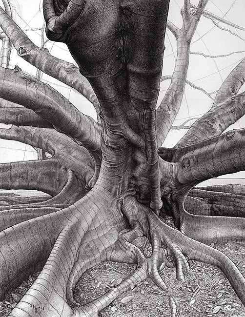
58 cm (w) x 74.5 cm (h), natural charcoal on acid-free drawing paper.
Date produced: May 2006.

I produced this drawing entirely on-site in the Adelaide Park Lands. It was produced as part of an art project called "Microcosm", where I spent two years (2005 and 2006) working on pieces directly from one Moreton Bay Fig tree growing in the Adelaide Park Lands.

Close to the heart, the main vessels are large, and flow with energy. Being close to the centre of the tree means close to its ‘heart’. Even though a tree may not have an organ called a heart (as animals have), which acts as a circulatory pump, trees also have circulatory systems. Trees need to bring water and nutrients up from the ground out to all of their leaves for generating energy from photosynthesis, for keeping their cells alive. And they need to distribute the results of all the photosynthesis back to all of its cells, including those in its roots. One might consider the important section of trunk just above the roots to be the tree’s heart. All major circulation passes through this region of the tree. Some trees can pump water silently more than 100 metres above the ground to their leaves. How do they do this, especially when a vacuum can only hold a column of water about 10 metres high?

The subject is also close to my heart. I know this tree from spending much time at it back in 1984, and again now during this two-year project. It is a huge organism with marvellous forms and a very strong ‘presence’ (a thrill from just being near the tree).

I am standing close to the centre of the tree. The large forms flowing closely past me make me feel as though I am confronting the ‘presence’ of the tree itself. It is a rich position to do a drawing from and I enjoyed the challenge of it. The angle of view is very wide, which provides plenty of challenges in itself.

I am pleased with the choice of natural charcoal for this drawing, allowing me to build up and rework areas of soft grey tone. Using sticks of natural charcoal forces me to work fairly broadly, because they don’t really allow for consistent crisp thin line work. Even so, much of the contour line work has to be extremely accurate to convey an accurate sense of the forms, and provide the ‘right’ rhythms. Many contour lines were removed and attempted 3 or 4 times to get them as I wanted them.

More information...


8. Under the Spread - A New Version of My Major Drawing


Under the Spread - A New Version of My Major Drawing
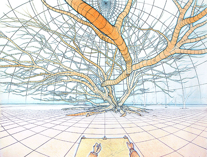
73cm (w) x 53cm (h), black biro and watercolour pencils on acid-free paper.
Date produced: August 2006

I produced this drawing mainly on-site in the Adelaide Park Lands. It was produced as part of an art project called "Microcosm", where I spent two years (2005 and 2006) working on pieces directly from one Moreton Bay Fig tree growing in the Adelaide Park Lands.

This drawing was produced as a way of somehow ‘completing’ a major drawing I had started and worked on from the same tree for some time during 1984. That major drawing was carried out on-site using black biro on about a dozen sheets of brown paper (that butted up next to each other in an array of 4 sheets high by 3 sheets wide).

I wanted to keep this new drawing as large as I could using a single sheet of white paper, but this meant that this drawing size was less than half the size of the original major drawing attempted in 1984.

This drawing has been done directly from the tree as much as possible as it is now (on-site), but several branches had been cut off since the drawing done 20 years ago, so the original drawing was used as a reference for those branches.

I used biro and coloured pencils, to keep production time down to a minimum (still took several weeks), as opposed to the time required for a production based on pastels and conté (several months for the level of detail required). Using biro was tricky, because I can't wipe out any 'dud' lines that I have drawn. I had to work very carefully, and make sure that I didn't leave nasty blobs of ink as I worked. More information...


9. The Orange Tree - Form and Space


The Orange Tree - Form and Space
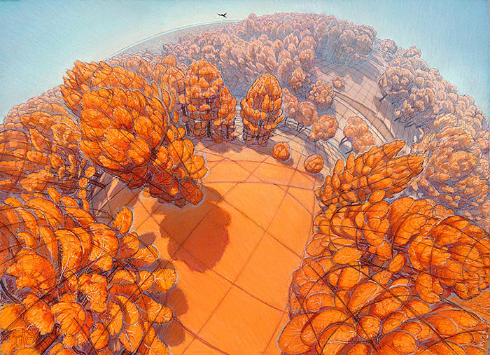
73 cm (w) x 53 cm (h), pastels and charcoal on acid-free paper.
Date produced: 2006 - May 2007.

I produced this drawing mainly on-site in the Adelaide Park Lands. It was produced as part of an art project called "Microcosm", where I spent two years (2005 and 2006) working on pieces directly from one Moreton Bay Fig tree growing in the Adelaide Park Lands.

With this piece, I tried to produce a strong expression of the tree’s forms, as seen from one good viewpoint, using all of the line work, the tones, and the colours used. Local colours are largely ignored. The colouring used is an exaggerated aerial perspective, where surfaces that are close to me are made more orange (to bring them forward), and surfaces that are more distant are made more blue (to send them back further). I have also tried to indicate the air that surrounds the forms using pale blues around the forms.

I have applied these same principles of colour to the ‘forms’ in the canopy, but kept its tone dark, to help enclose the scene - as it feels in reality.

Contour lines indicate the cross-sectional shapes of the forms, the orientation of surfaces to the viewer, and set up ‘rhythms of flow’ in the depictions of forms. These lines are ‘felt’ from looking at the real forms and are considered by me to be extremely important for the accurate expression of the forms experienced. Even though Moreton Bay Fig trees have a texture in their bark that often provides rings around their forms, there are many places where those natural rings are not what is required for the expression of the forms, especially at junctions. The contour lines need to be drawn with high accuracy, and with quite a bit of experimentation. The end result is felt, to see if it expresses the forms closely to the way they ‘feel’ in reality.

This drawing took more than 3 and a half months to complete, working for most of that time directly from the tree. It was done over a period of more than a year, in several groups of sessions. I worked on getting the piece finished late in 2006 before moving from North Adelaide. The overall tone was darkened a little, and the colour work refined. I put in about 8 days of work in mid May 2007, back in my studio (away from the tree), cleaning up parts of the whole drawing.

I am very happy with this piece. It is a reconstruction of the scene that was experienced, into a new 2-dimensional image. There was a lot of extremely accurate observation and line work required in the expression of the forms encountered. The colours and tones are based on how the forms were felt rather than on a ‘photographic’ description.

More information...


10. Life’s Ancient Engine


Life’s Ancient Engine
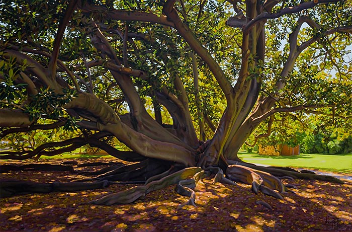
97 cm (w) x 112 cm (h), oil paints on linen canvas.
Date produced: Jan - May 2007.

This is an extended development of a previous painting titled “The Sun”. I was very happy with “The Sun” and after some time looking at it, I wondered about adding a section above the painting (showing an extension into space) and a section below (showing a view under the surface of the water).

The main reasons for considering this extended composition were to:

  1. build on a design that was already an excellent foundation. “The Sun” is still one of my favourite paintings.

  2. to include more obvious references to:

    • our sun’s place in the universe,

    • the role that the sun played in creating life on our planet, and

    • the role that the sun plays in sustaining life on our planet.

The ideas in the second reason above come from an understanding of life that is based on scientific research - seeing our sun as just one of millions of other suns in the universe; life on our planet developing from the product of the complex soup of chemicals in the sea, the action of sunlight on some of those chemicals, the temperature of the sea water (from the sunlight), the atmosphere, and all of the other special conditions that were met (experiments in the 1950s produced amino acids and other complex molecules that are the building-blocks of Earth's life forms, by reproducing conditions from our planet’s early history); and much of the life on our planet being based on a supply of sunlight on plant life (mostly in the form of single-celled sea algae) that produces food and oxygen from the sunlight, water and carbon dioxide.

More information...


11. Under A Sunlit Canopy in Angas Gardens


Under A Sunlit Canopy in Angas Gardens
90 cm (w) x 60 cm (h), oil paints on board.
Date produced: March 2017 - September 2018.

We live in an amazing world. I find a lot of beauty and interest, and gain immense inspiration from the natural world around me.

This painting tries to capture a single view of the real world, just enjoying the colours, tones, forms, spaces, sounds, smells and general magic from being under the sunlit canopy of this magnificent Moreton Bay Fig tree, growing in a highly accessible place in the Adelaide Park Lands. It felt special just to be close to such a huge living organism, with its own atmosphere and amazing spreads of massive boughs and exposed buttress roots. This particular tree is a personal favourite of mine and was the subject of a two-year art project of mine, titled "Microcosm" (in 2005 and 2006).

I wanted to try to produce an oil painting of the same view as that used for an on-site pastel, but that didn't need to be framed behind glass. I typically need to frame my pastels behind glass, because they are all unfixed (fixing is done with a layer of sprayed lacquer, but this does change the refractive index of each pigment [it changes all of the colours] and the transparency of the pastel layers), and are therefore extremely fragile. My pastels have mainly many tiny granules of colour just sitting on paper. Glass tends to include distracting reflections, and makes the darker colours more difficult to see. By producing a larger copy with oils, I hoped to create a large pastel-like image that didn't require a protective layer of glass, and that had an even wider dynamic range of observed subtle tones and colours than pastels can reproduce. The big problem was being able to get the oil painting to the subject (and home again safely) enough times to capture the subtle colours one can observe from the real subject in real light. I prefer to work entirely directly from the subject, but knew from previous attempts at producing paintings on-site, that I would not be able to get this oil painting out on-site enough (if at all). I live quite a distance from this tree, and don't have a car to transport it. Even if I did, I know that I wouldn't get enough time at the tree with the same lighting conditions to produce this painting. The light is only 'good' for about an hour each sunny day, and even this changes in the span of just a week or two (as the earth orbits around the sun each year). Other things change over the course of a couple of weeks, such as the length of the grass, the dryness of the ground, etc.

More information...


12. The Linguist - Marianne


The Linguist - Marianne
29 cm (w) x 37 cm (h), oil paints on board.
Date produced: June - November 2019.

This painting was done using a technique which allows a painter to directly compare the tones (and colours) of a subject image with those of a painting or drawing. A mirror is used for directly comparing tones, colours and the outlines of a subject image with those of a painting in progress.

I have been painting and drawing for more than 45 years, but have only come across this technique as a result of fairly recently watching a documentary film made in 2013 titled, “Tim’s Vermeer”.

“Tim’s Vermeer” is about some of the ideas, skills and desires of one man, Tim Jenison, who is apparently not a painter, but who wanted to produce a similar painting to one that was produced by Jan Vermeer (born in 1632 and died in 1675 at the age of 43).

The central idea that Tim Jenison presents convincingly in the documentary, is that Vermeer probably used a mirror (a technology that was developed before his time) in combination with a ‘camera obscura’ (a darkened room with a lens that projects an image of a lit room) to help him paint images with ‘photographic’ tonality, colour and spatial accuracy. Tim Jenison proposed an ingenious method of using a small mirror to compare the tones and colours in a real scene (typically an indoor scene) from a small image projected by a ‘camera obscura’, with those made with paint on a painting. Photography was yet to be developed. After Vermeer’s death, it would take around another 150 years to develop a reasonable form of photography.

This painting was my first serious experiment into using the technique of painting using a mirror as described in that documentary.

This portrait started as a photograph of my wife in natural light. She is a linguist, born in The Netherlands with skills in spoken and written Dutch, German, French, Italian, and English. I arranged the subject so that she was appropriately surrounded by personal objects, she had interesting lighting across her facial features, and she had a good fleeting smile on her face. I wanted to have her head facing slightly away from my view, and not have her looking directly at me.

I decided to paint a greyscale image to make the colour-mixing process less complicated (just need to use black paint and white paint). I found that the whole painting still took a considerable amount of time and skill and judgement to get it to a stage where it felt complete. More information...


End of this exhibition display.


Web Gallery Home